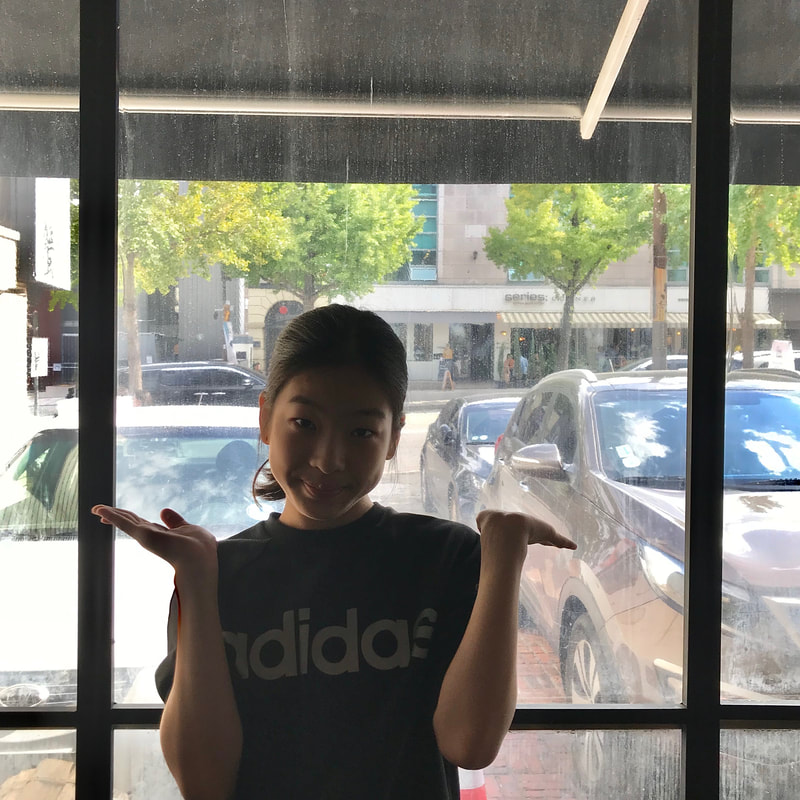
 For this photo, I was asked to asked to take a picture of someone so that they are being framed by a natural or man-made object. I situated my subject, Sylvia, in between two metal bars across the window that create a frame around her. I really like the setting of this photo and I think the frame really makes the focal point very clear, but the lighting is really bad. Sylvia is facing her back to the sun, so she looks very dark while the background is extremely bright. It may have been a better idea to take a picture of a silhouette. 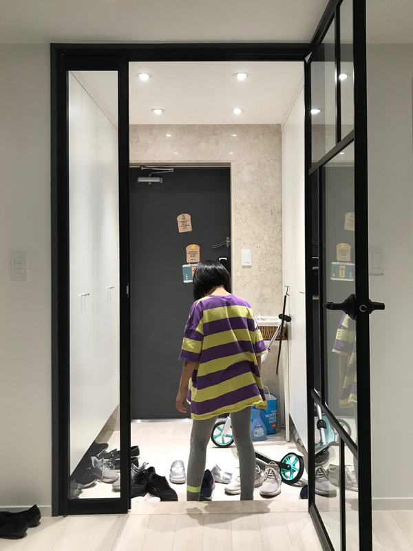 For this photo, I was asked to asked to take a picture of someone candidly so that they are being framed by a natural or man-made object. My sister was walking towards the door, and the glass doorframe created a frame around her. Unlike the other photo, the lighting was good, but even though it is obvious that my sister is the focal point, there are some aspects of the background that I find distracting.
0 Comments
 Photograph by Hung Pham  Photograph by Huu Tam  Photograph by Kei Nomiyama 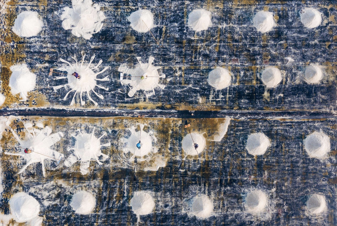 Photograph by Tuan Ngyuen 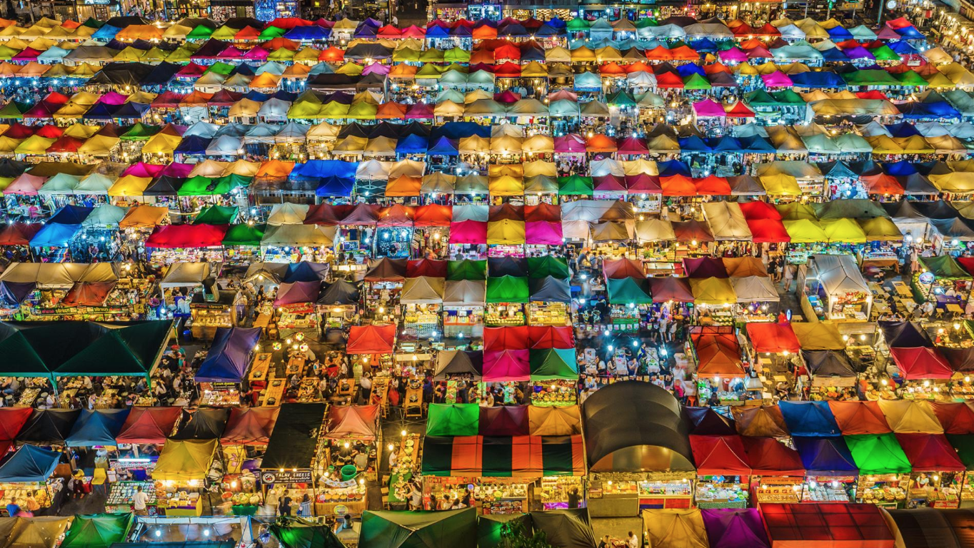 Photograph by Aotaro 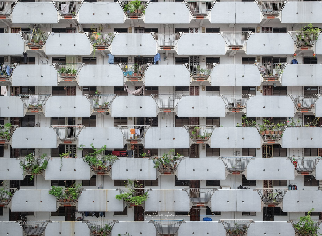 Photograph by John Kimwell Laluma 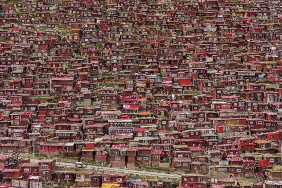 Photograph by Anton Gautama 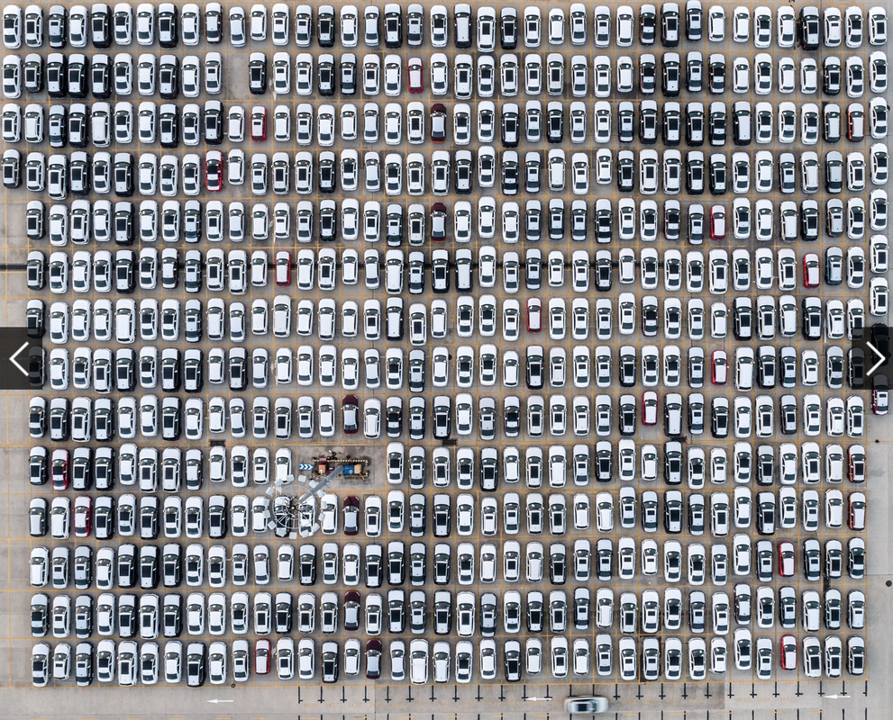 Photograph by Attila Balogh 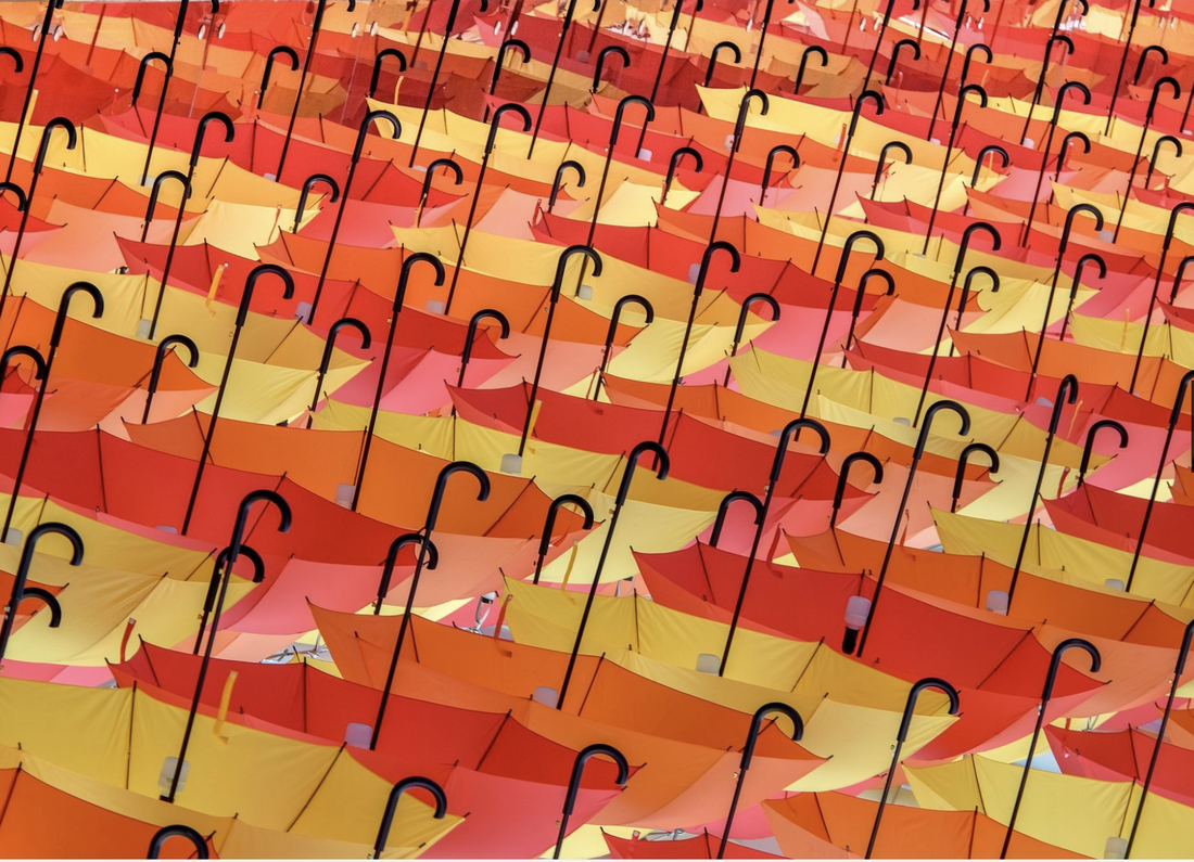 Photograph by khai? nguyen tuan 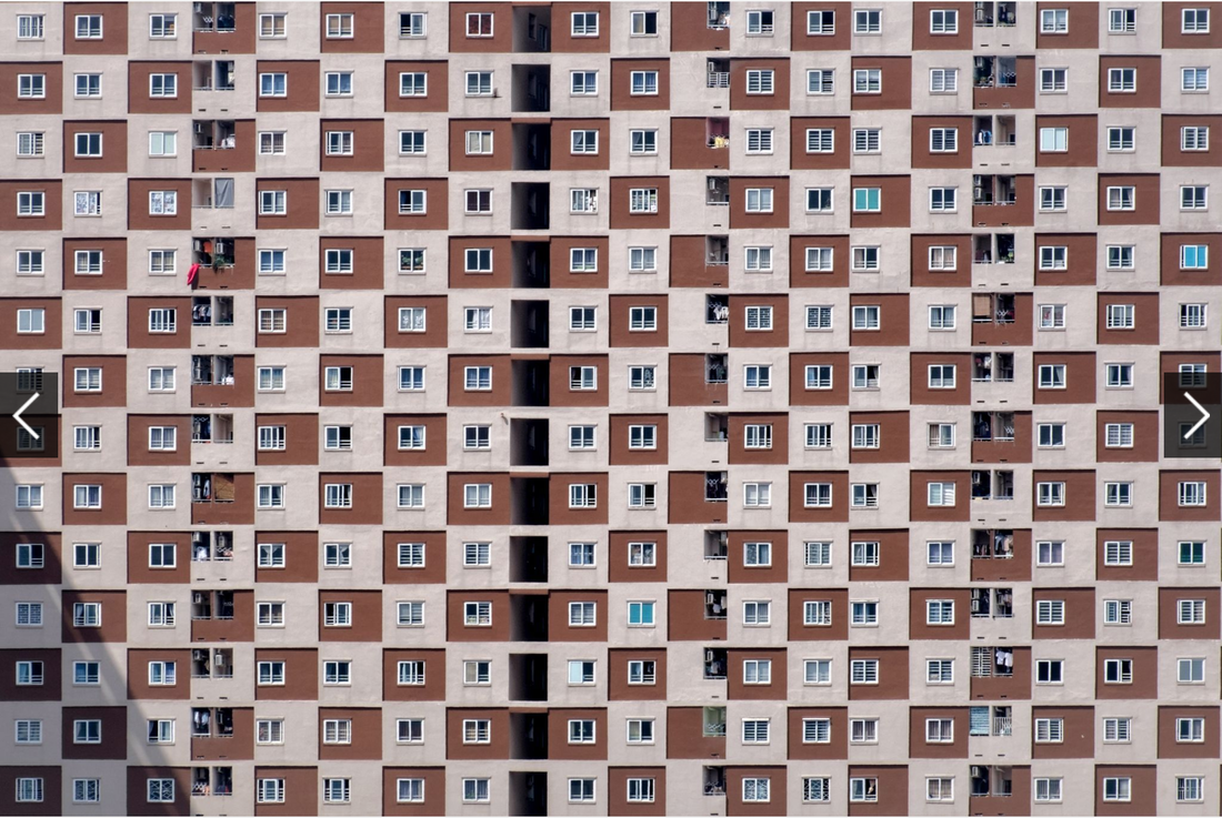 Photograph by khai? nguyen tuan
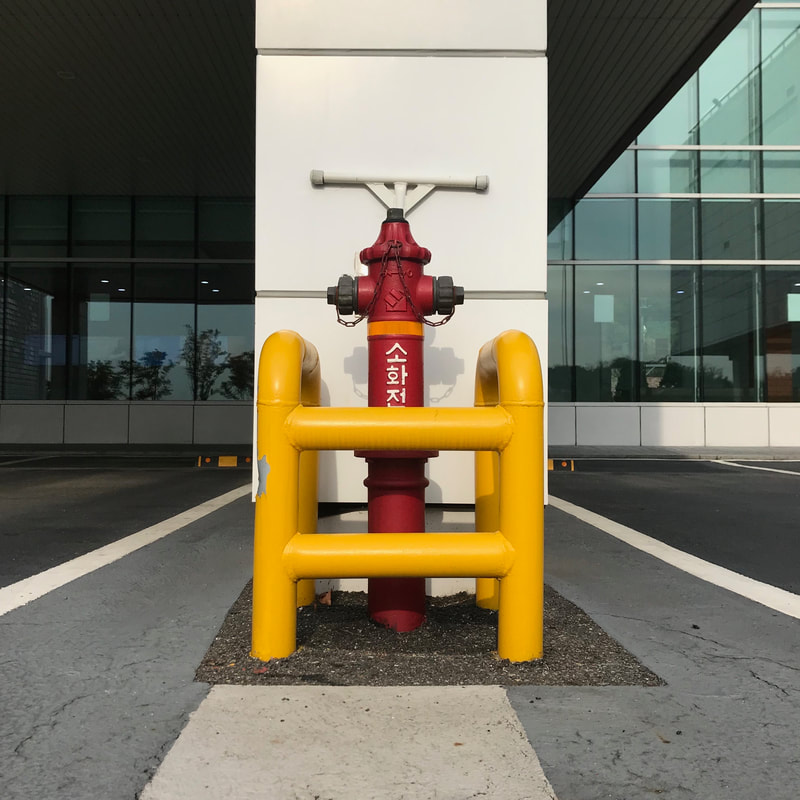
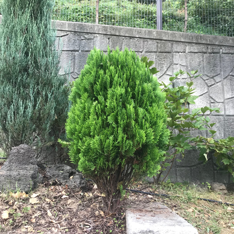
leading lines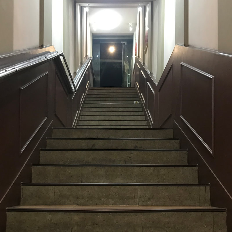 In this photo, the lines on either side of the stair are parallel and they converge to draw the viewer's eye to the subject, which is the door that leads outside. I think that the angle of the photo isn't completely straight and personally, I don't find the picture very interesting to look at. But I really like how using the leading lines technique makes the focal point very obvious and makes the photo look balanced. converging parallel lines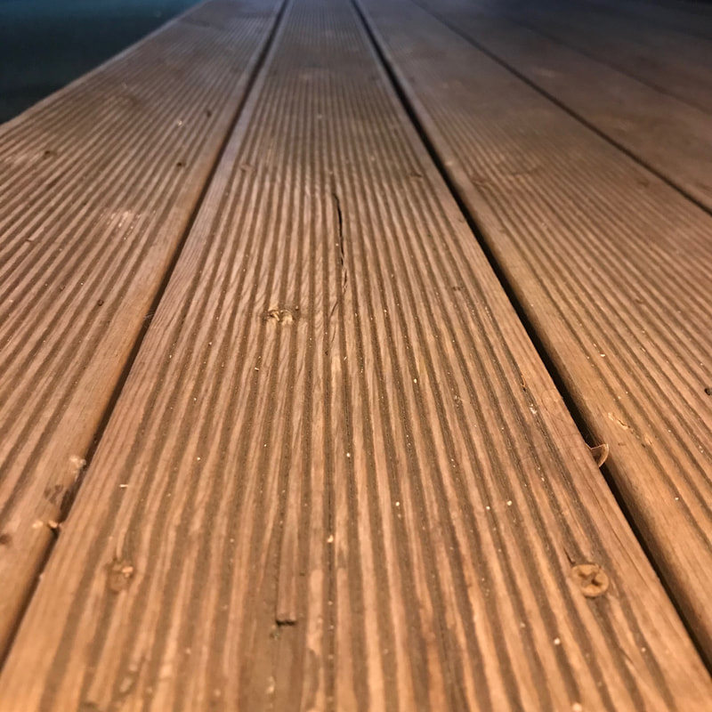 In this photo, the lines on either side of the piece of wood converge, so even though the lines are parallel, it looks like they are getting closer and the wood is getting smaller. The most difficult part to taking this picture was getting the right angle to make the lines appear as if they are converging and while keeping it straight. horizontal lines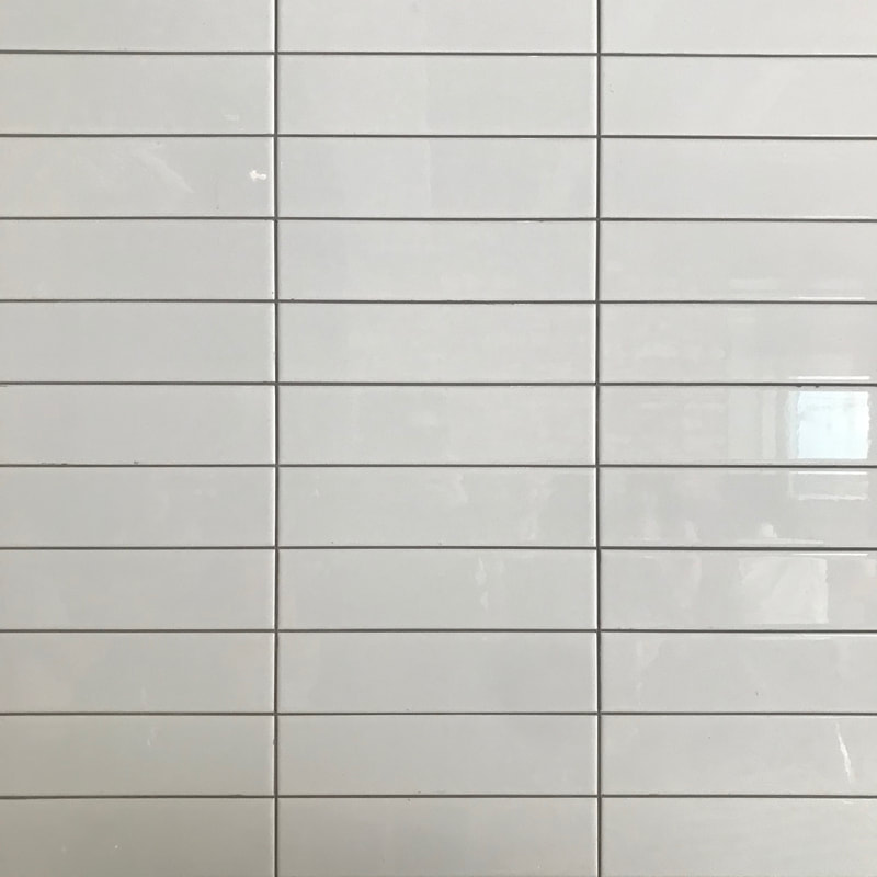 This photo has horizontal lines that convey power and strength. I think the lighting is a bit dark, making the wall look rather grey, but I really liked the pattern. Again, the hardest part was trying to get the perfect photo where all of the lines were straight. vertical lines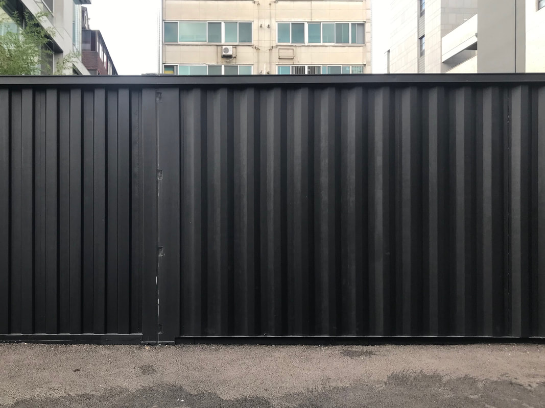 In this photo, there are vertical lines that also convey power and strength. The only thing that I dislike about this photo is that I wish there were less things in the background that are a bit distracting because the subject is just plain black. Just like the photo above, the hardest part was trying to get the perfect photo where all of the lines were straight. diagonal lines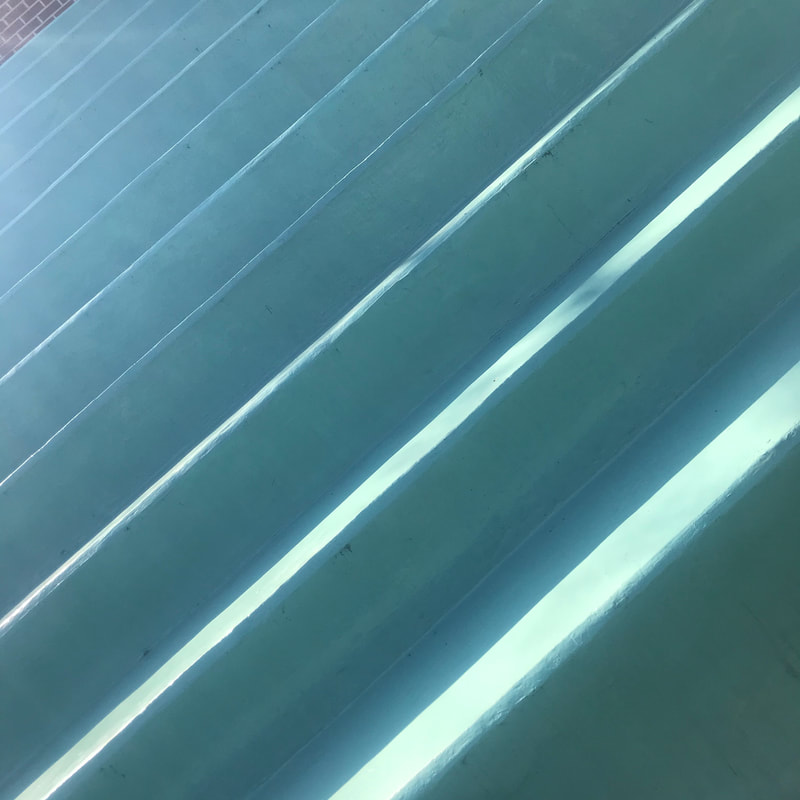 This photo has strong diagonal lines, which show movement. I think that this photo looks slightly awkward because I just tilted my camera in order to make the horizontal lines of the stairs diagonal. Also the photo is rather dark because there are a lot of colors. But, I really like the bright color of the stairs. curved lines In this photo, the focus is on the curve of the leaf's edge, which shows gracefulness. I liked that the leaf really stood out as the subject because of it's bright green color against the plain background. I found that the most difficult part was finding a good subject and taking the photo in a way that really focused on the curved lines.
 Photograph by Zhu Xiao 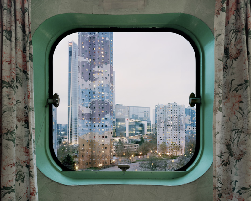 Photograph by Laurent Kronental  Photograph by Saulius Damulevicius 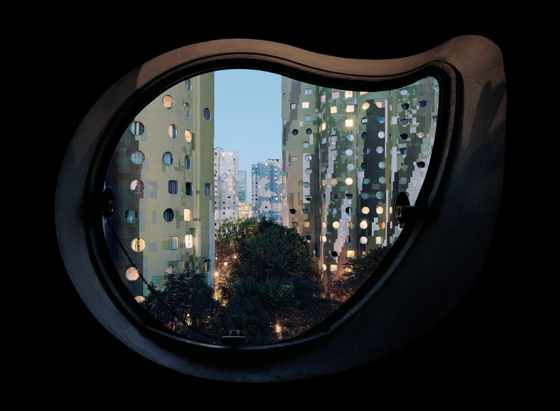 Photograph by Laurent Kronental 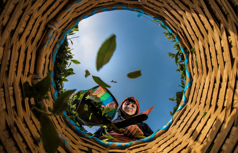 Photograph by Mehmet Aslan
leading lines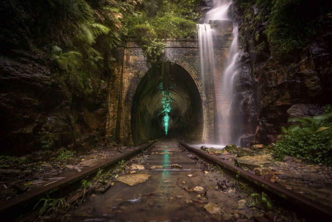 Photograph by Josselin Cornou converging parallel lines Photograph by Fran Llano horizontal lines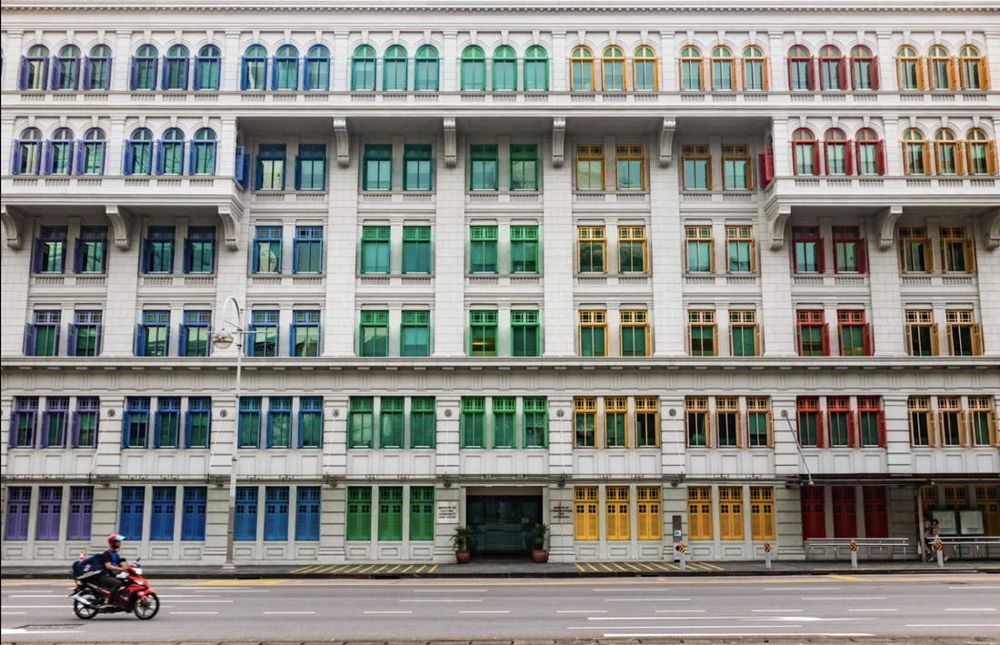 Photograph by Andrei Z. vertical lines Photograph by Stephanie Hohmann diagonal lines Photograph by Aya O. curved lines Photograph by Srdjan Vujmilovic
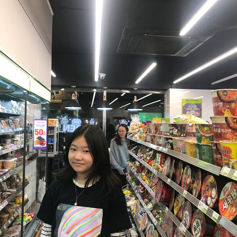
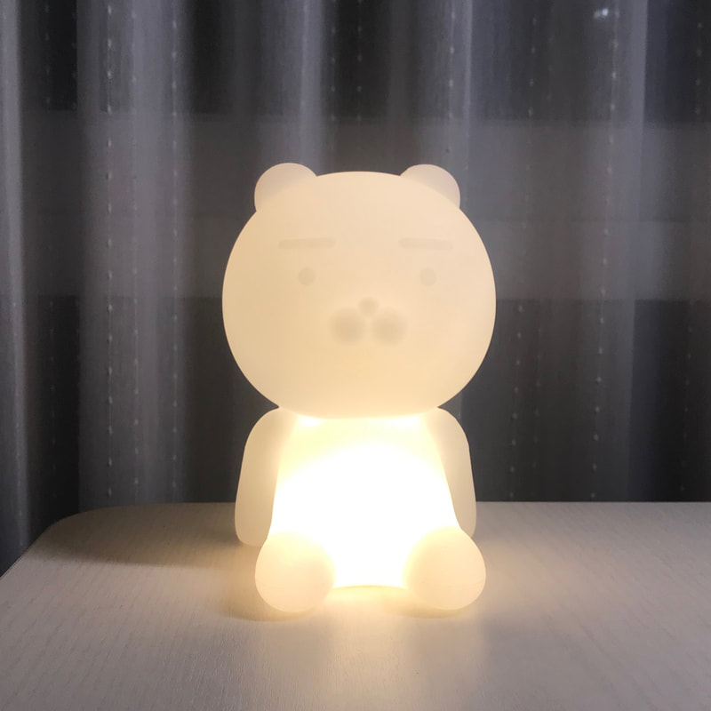
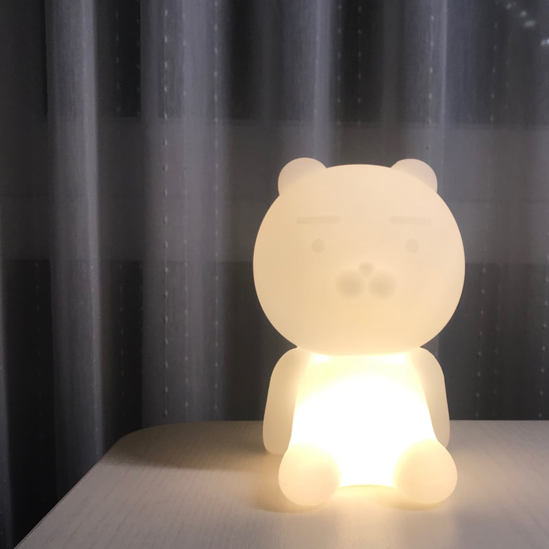
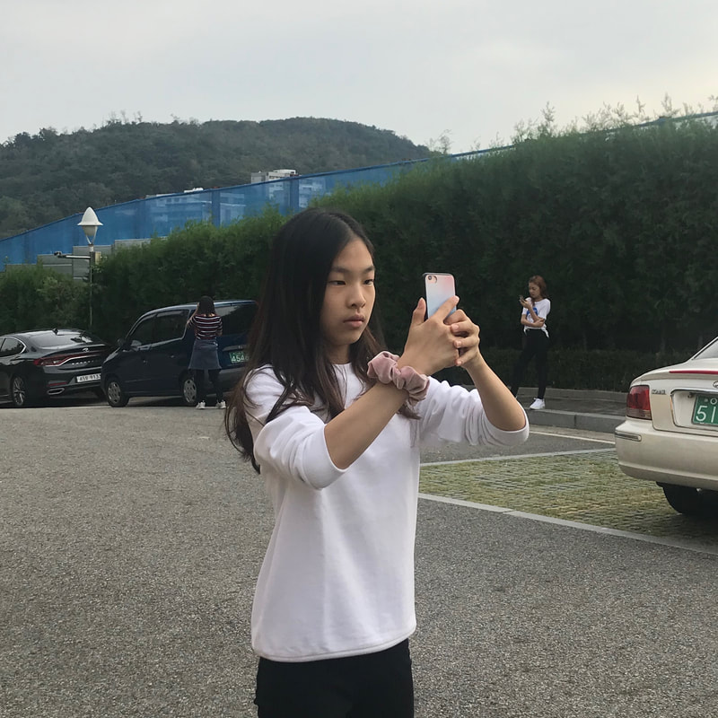
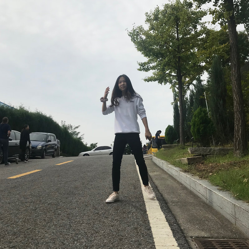
For this assignment, I was asked to take six photos of three different subjects. For each subject I took two photos. One of them followed the rule of thirds, and the other did not. I did this by changing the settings on my phone to show a grid when I took the photos so I could place my subject along the lines. I thought that rule of thirds could be applied to any photo and would automatically enhance the image to make it better. While this was true for some photos, I learned that in some cases, using the rule of thirds may actually make the subject stand out less, or make the photo look awkward or unbalanced.
I prefer the picture on the left.
I prefer the picture on the left.
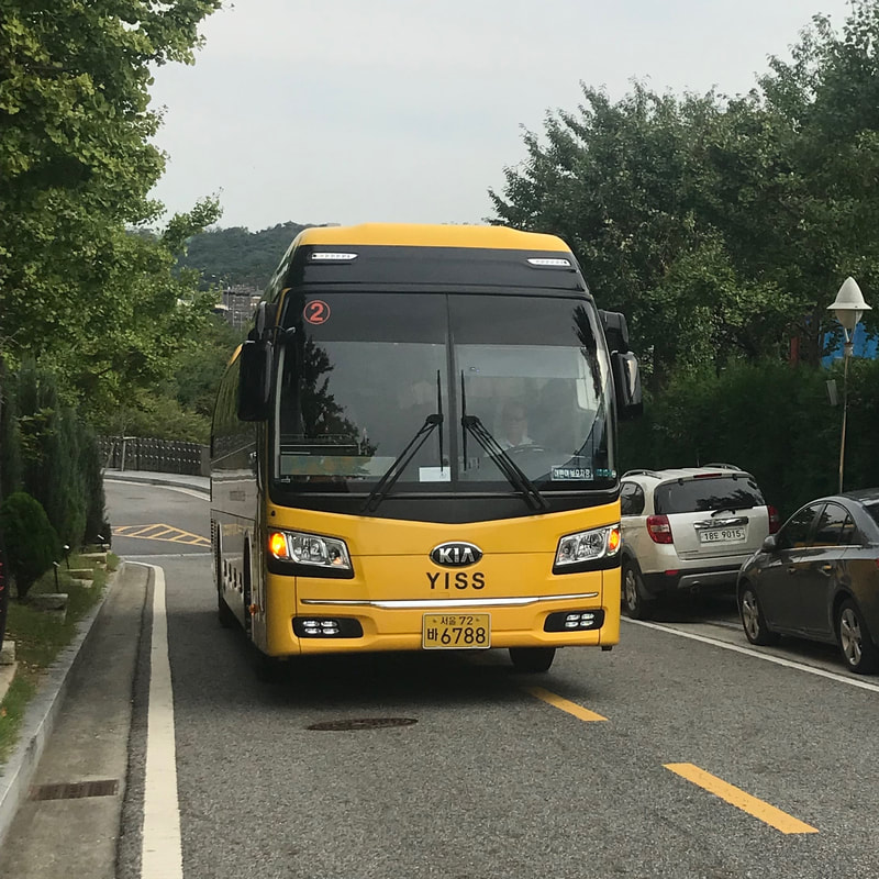
I prefer the picture on the right.
 Photograph by Placido Faranda  Photograph by Sabriamin M.  Photograph by Jorge Hauser  Photograph by Manish Mamtani  Photograph by Paul-Vlad Epure  Photograph by Sonalini Khetrapal  Photograph by Victor Atelevich  Photograph by Teong Lin Ng  Photograph by Marco Anfossi  Photograph by Leigh Ayres
 Photograph by Yasuyuki O. 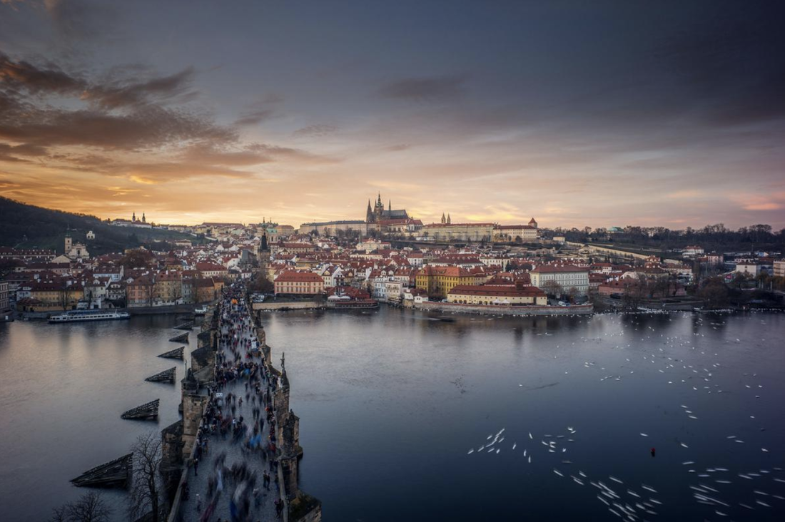 Photograph by Tian-Yu Xiong  Photograph by Tran Tuan Viet  Photograph by Shih-Hsun Lin 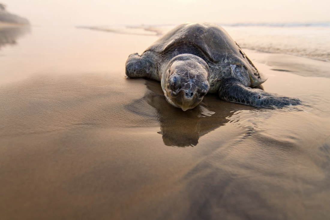 Photograph by Siddharth Khadanga  Photograph by Dong Giang  Photograph by Fred Lemire 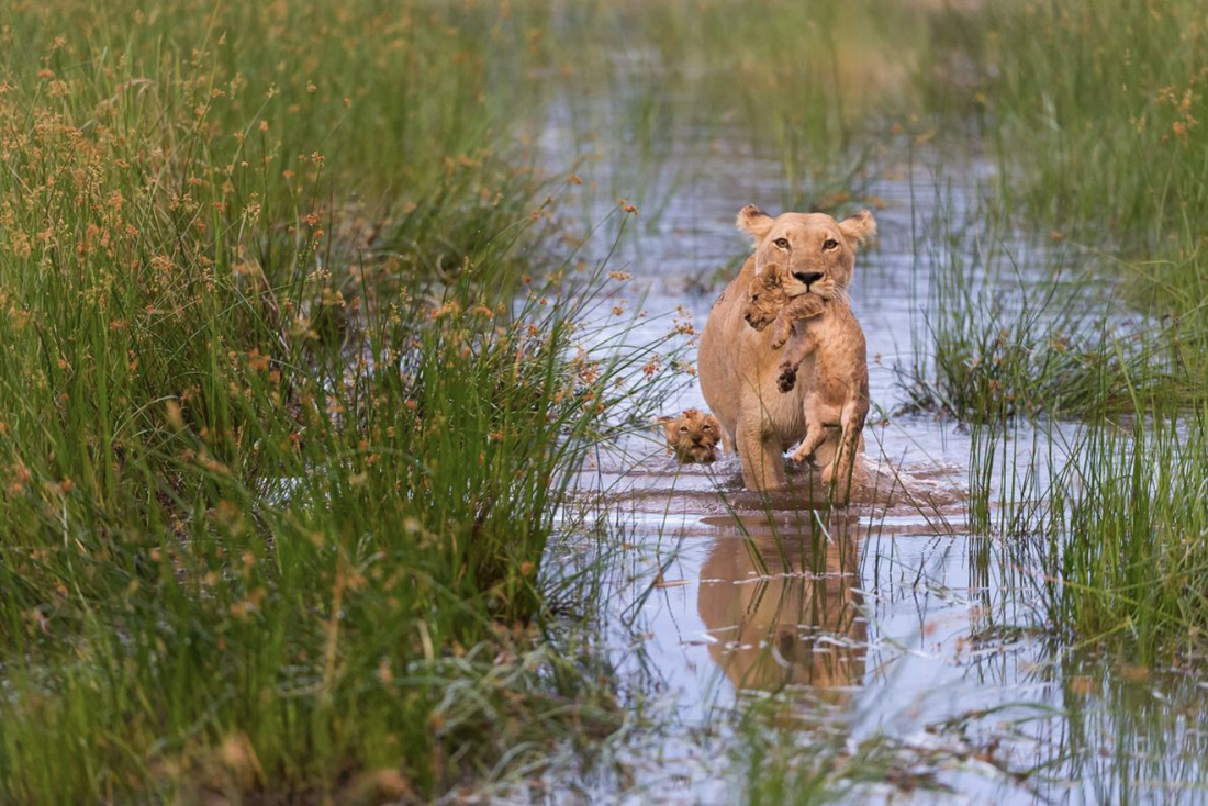 Photograph by Connie Bowen 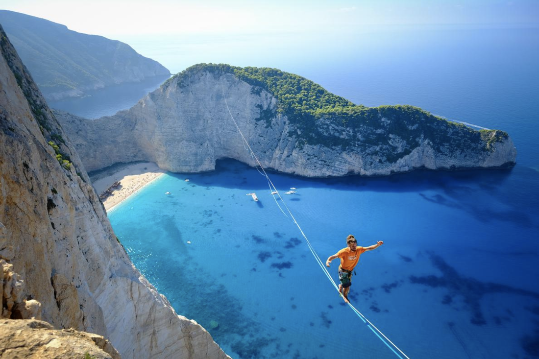 Photograph by Aidan Williams  Photograph by Amy Osness  Photograph by Tim Bryan  Photograph by Anastcia Malyh
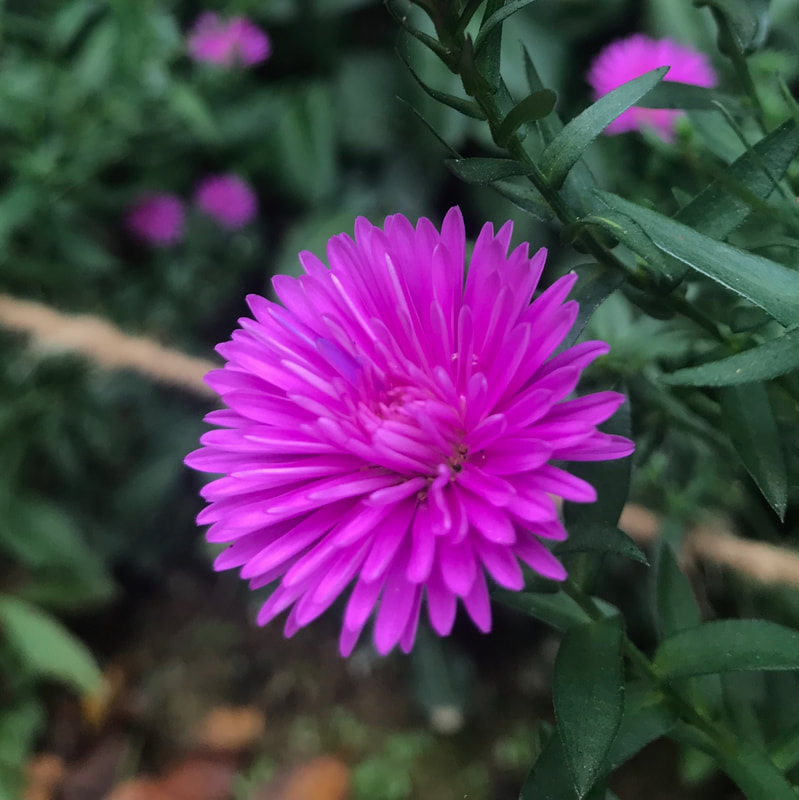
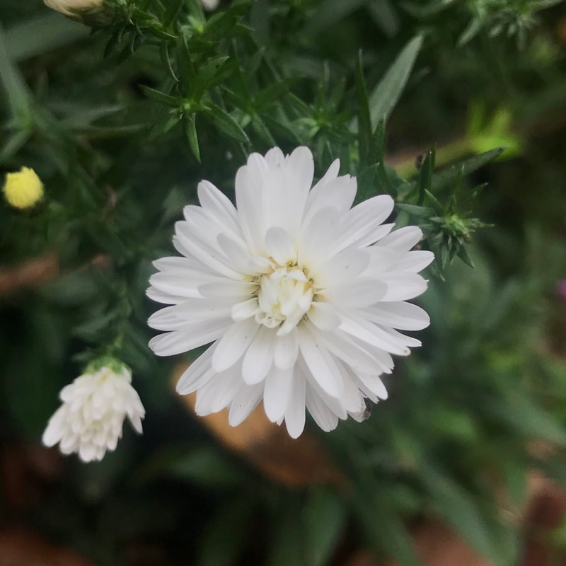
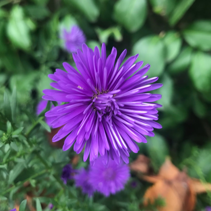
The photo of the pink flower is my favorite because I like how the background is really blurry so that the color and shape of the flower stand out a lot. The hardest part of this challenge for me was making sure each of the photos had very clear focal points. I think this challenge helped me see that you can really take pictures of anything, and you can make a lot of different things your focal point.
|