|
In this assignment, I learned how to create relative and absolute links. I used Sublime Text to create a webpage about websites that I like and all of the webpages that I created. 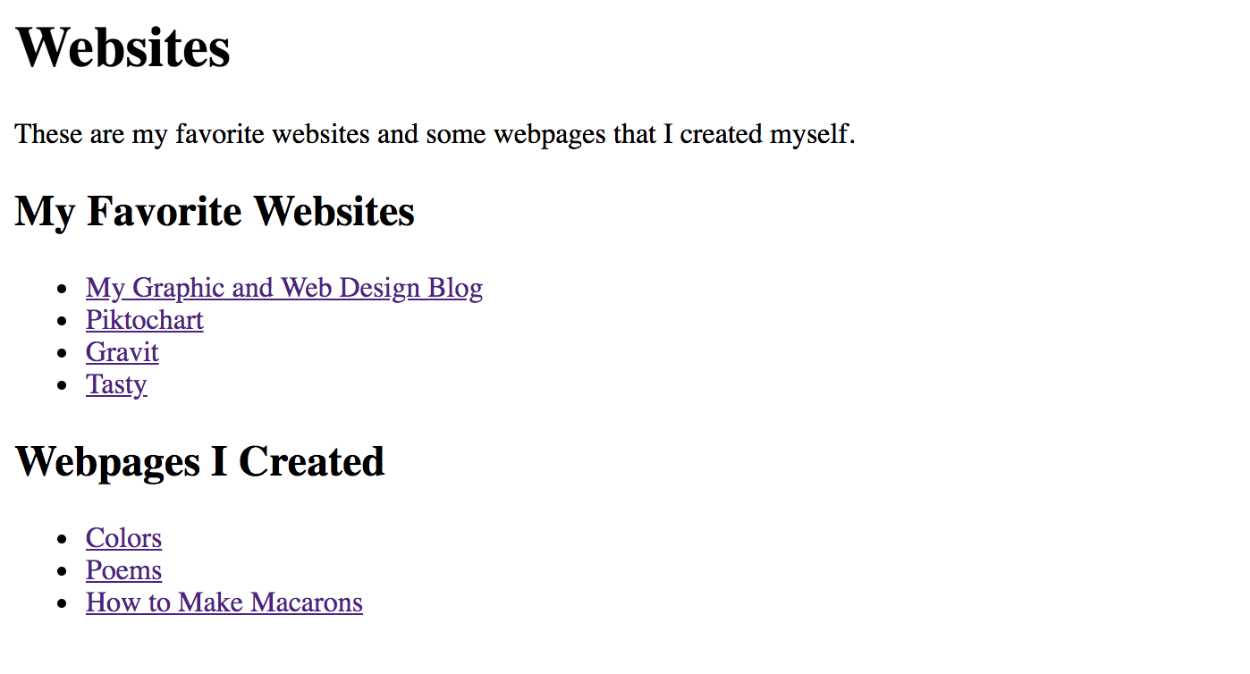 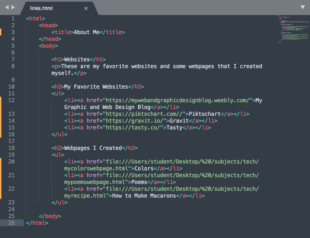
0 Comments
In this assignment, I learned how to create an ordered and ordered list. I used Sublime Text to create a recipe page on how to make macarons. It was a little more complicated than the previous assignments but it was very fun. 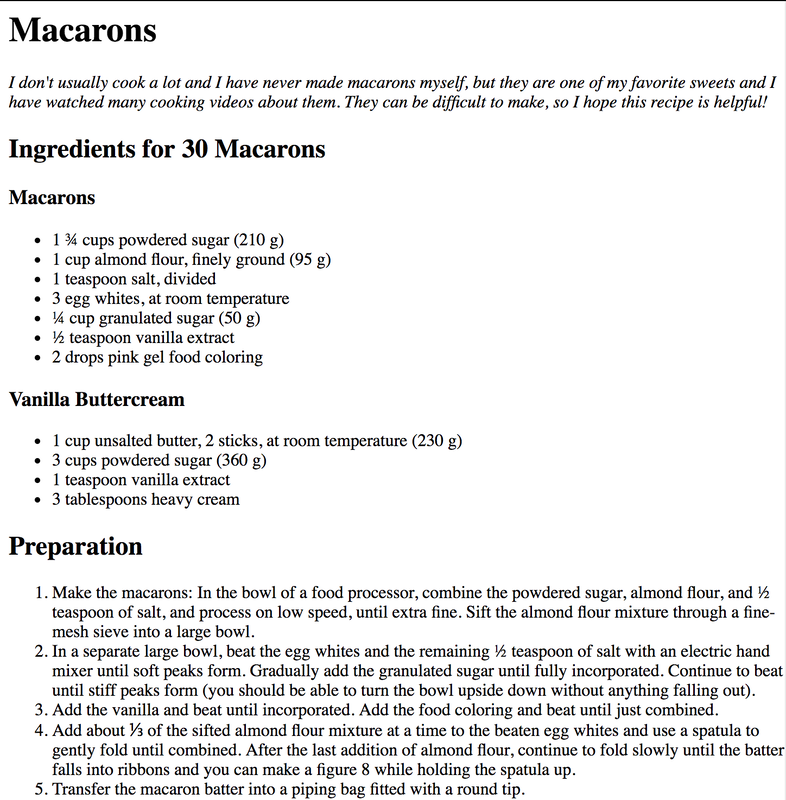 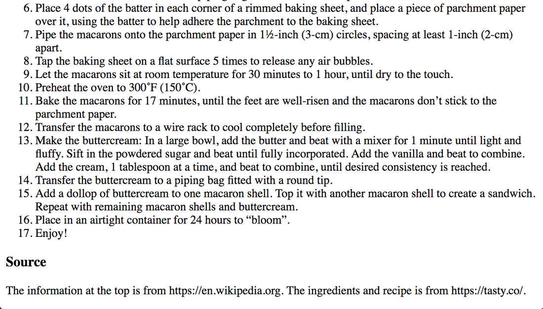 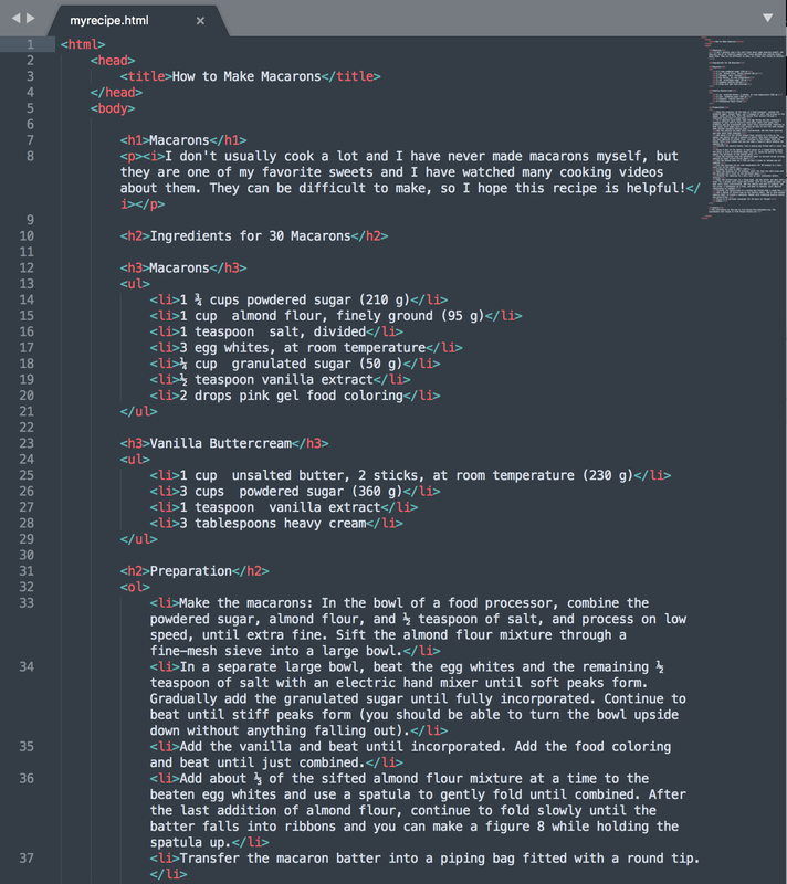 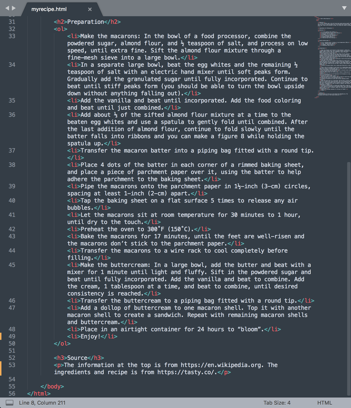 In this assignment, I learned about HTML structure. I used Sublime Text to make a basic webpage about colors. 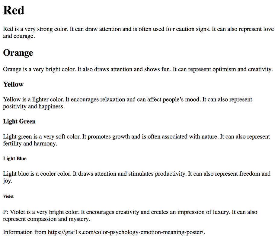 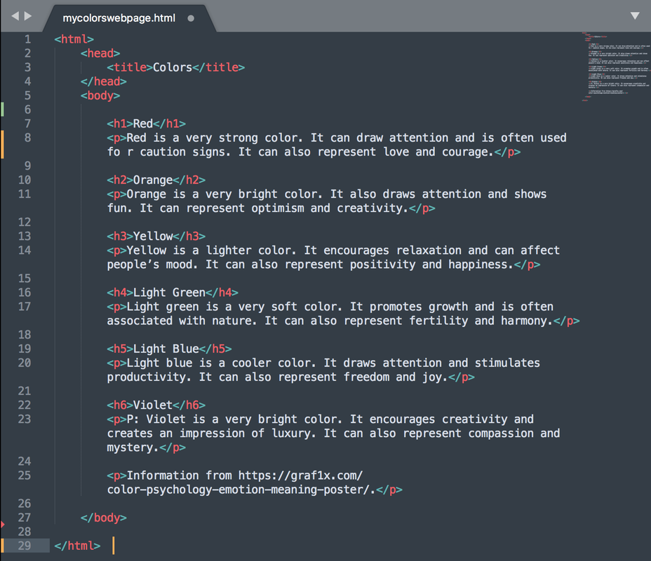 In this assignment, I learned about how white space is displayed in HTML and how to use italic, bold, line break, and horizontal rule tags. I used Sublime Text to make a poetry page. 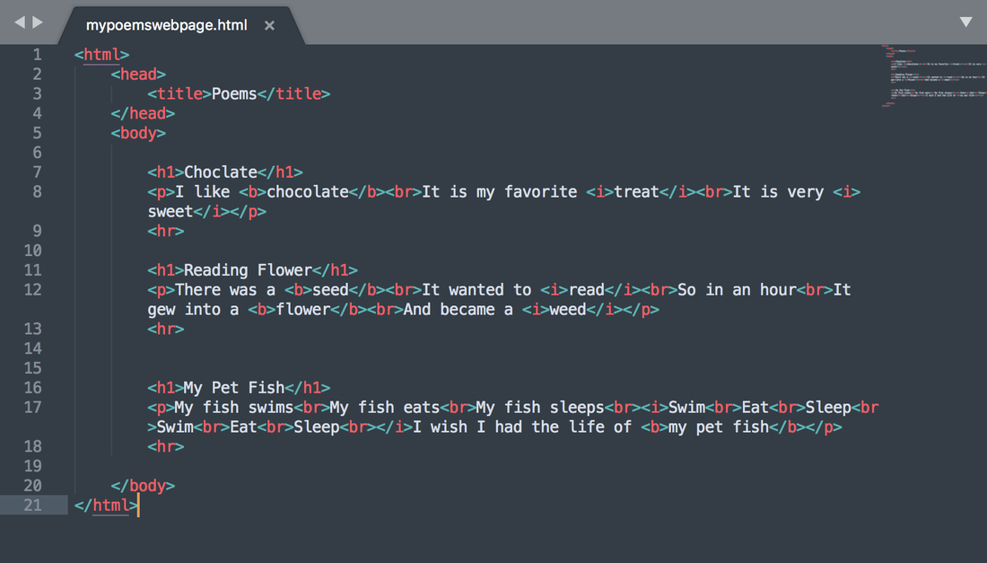 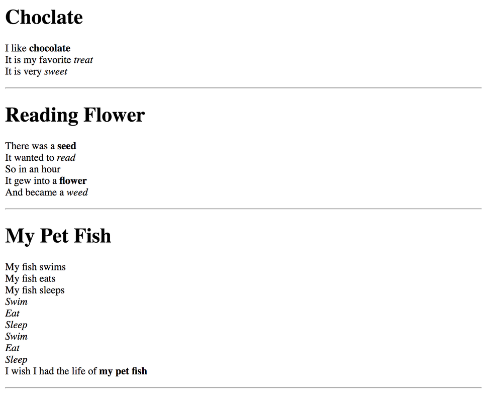 In this assignment, I was asked to create three variations of each of my completed logos. I did this by changing different elements on each of the logos. For example, I changed colors, added boxes, and created shadows. The hardest part of this process was finding different ways to put what I envisioned for my logo into the actual logo. I had to experiment with different elements until I was happy with what my logos looked like. My favorite part of this project was seeing the logos coming together and becoming what I had seen in my mind. I learned a lot about the different elements I can change on Gravit through this assignment, and I really enjoyed it. 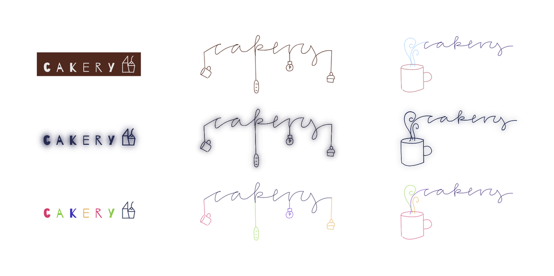 The name of my brand is Cakery, and it is a company that has combined a cafe and bakery. I wanted my brand to be a very comfortable cafe where people can feel welcomed. It can be a quiet place to study, or just a small coffee shop where friends can come to have fun. I wanted Cakery to feel like a second home for people. This is why I tried to create logos that represented comfort and calmness, and that anyone can come to the cafe and feel at home. I chose the second logo because I felt like it communicated the message I wanted while it was not very complicated. 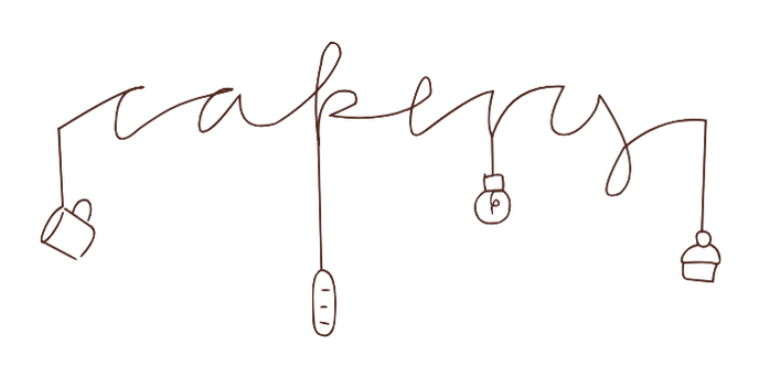 In this assignment, I brainstormed about twenty different design options for my logo. My logos are for a store that has combined a cafe and bakery. I ended up choosing the logo with a hanging cup, baguette, lightbulb, and cherry, the logo with text coming out of a cup, and the logo with a house and cupcake. The logos represent comfort and calmness, and that anyone can come to the cafe and feel at home. My least favorite logo was the one on a cup because it was very hard to read and didn't represent the fifteen words well. I really enjoyed this process and it was very fun. The most difficult part was representing all of the characteristics I wanted in an image. 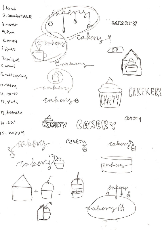 In this assignment, we were asked to use Adobe Color to create four different color palettes with five colors each on Gravit. To do this, I created multiple shapes and changed their colors by checking and recording the hexadecimal code for each one from Adobe Color. Then, I labeled each palette by its "scheme" name and labeled each color by its HEX code. There are four color palettes: monochromatic, analogous, complementary, and triadic. Monochromatic color schemes have one hue with various saturation and brightness levels. Analogous color schemes have hues that are next to each other on the color wheel. Complementary color schemes combine hues from opposite sides of the color wheel. Triadic Color Wheels combine three hues evenly spaced around the color wheel. My favorite of the color schemes was the triad because I thought that it was able to put a lot of colors together that weren't very similar but looked very nice when put together. 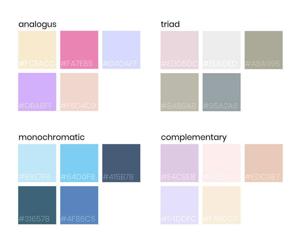 For this assignment, I was asked to show fifteen different colors with simple shapes, a piece of artwork, or an illustration traced or created with the pen tool using Gravit. I chose to use a basic shape, so I created one circle with the size that I wanted and made 14 copies of it in different the colors. I then clicked the color on the right sidebar to find the RGB values and hex code. Using this information, I labeled the color of each circle. I had the most trouble with the alignment and proximity. The colors that I used are connected in a gradation, so I wanted to show this by creating a larger circle of circles. However, because all of the colors had different RGB values and hex codes, the length of the boxes were different, so there were places where the text overlapped with another circle or where there was too much white space. I played around with the formatting, but no matter what I did, everything unaligned. In the end, I gave up creating a circle and moved the circles into three rows of five. Although this doesn't connect the colors as much as the circle, it looks much neater and aligned. I really like how the formatting of turned out. The colors are very pretty and the assignment is very easy to read and understand. 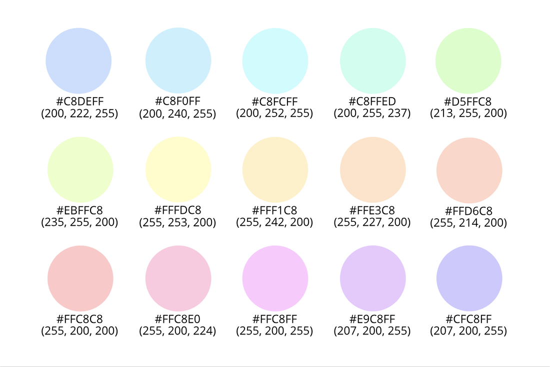 I have recently been learning about typography. Typography is the visual component of written text. It is not only font, but also includes the type composition, text formatting, and page layout. Each font has a personality and a purpose. No two fonts are the same, and although they may not directly change the meaning of a word, they can affect the idea that it communicates. Each font conveys its own feeling or message and has its place to be used. Thats why you must be careful about what type of font to use for certain text. I have learned five different types of fonts in class: Serif, Sans Serif, Monospaced, Script, and Novelty. Serif fonts have feet and are used in large blocks of text and print. Unlike Serif fonts, Sans Serif fonts do not have feet and can be used for headlines, titles, small blocks of texts. It is also used on the web. In Monospaced fonts, each letter takes up an equal amount of space. It is used in coding, but isn't usually used for large blocks of text. Script fonts usually look cursive, calligraphic, or handwritten. They are sometimes difficult to read, so you should be careful. They are good for logos, headlines, and details. Lastly, Novelty fonts can be used to grab your attention. However, each font's popularity will come and go as they are usually very bold and you shouldn't overuse them. typeface comparisonIn this assignment, I used Gravit to compare the five different types of fonts: Serif, Sans Serif, Monospaced, Script, and Novelty by finding an example of each font type. 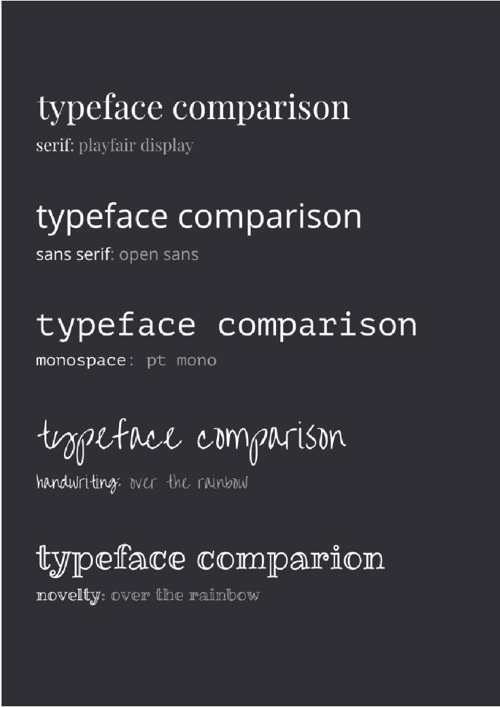 word portraitsIn this assignment, I also used Gravit to compare the different personalities of different fonts by using a font for a word that matches its concept and a word that does not. 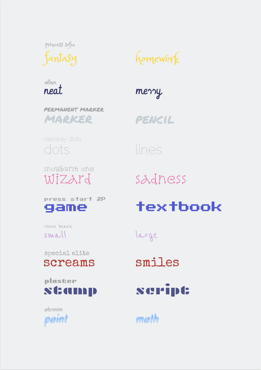 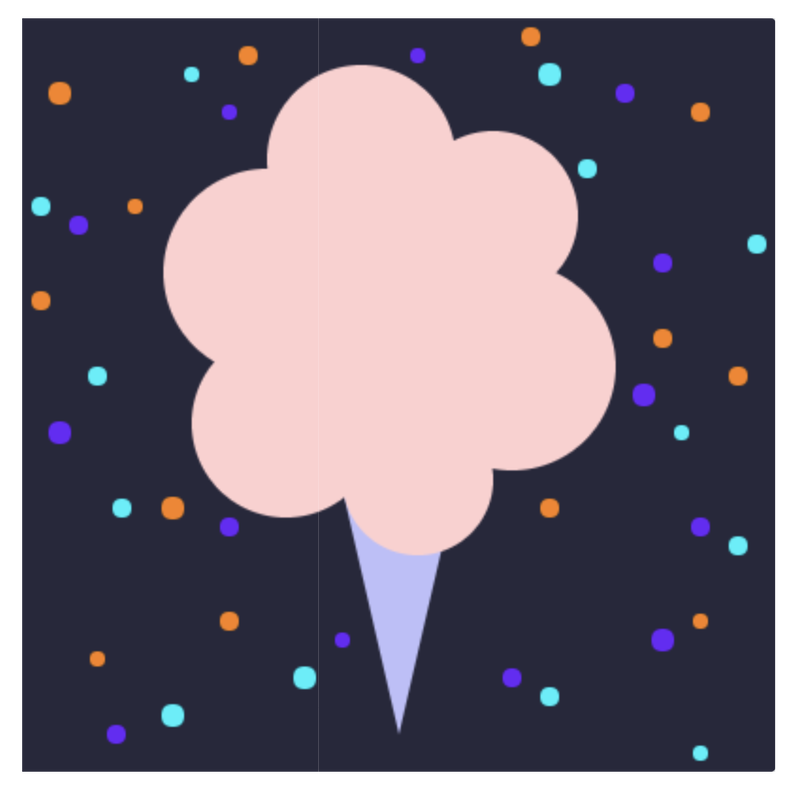 Code: background(40, 40, 60); noStroke(); fill(190, 190, 250); //cone triangle(170, 250, 230, 250, 200, 380); fill(255, 207, 207); //cotton candy ellipse(130,135,110,110); ellipse(180,75,100,100); ellipse(250,105,90,90); ellipse(260,185,110,110); ellipse(140,215,100,100); ellipse(210,245,80,80); ellipse(190,165,120,120); fill(250, 130, 20); //orange ellipse(20,40,12,12); ellipse(380,190,10,10); ellipse(340,170,10,10); ellipse(360,50,10,10); ellipse(10,150,10,10); ellipse(40,340,8,8); ellipse(360,320,8,8); ellipse(110,320,10,10); ellipse(270,10,10,10); ellipse(60,100,8,8); ellipse(280,260,10,10); ellipse(80,260,12,12); ellipse(120,20,10,10); fill(110, 20, 250); //purple ellipse(110,50,8,8); ellipse(360,270,10,10); ellipse(330,200,12,12); ellipse(340,130,10,10); ellipse(20,220,12,12); ellipse(50,380,10,10); ellipse(340,330,12,12); ellipse(170,330,8,8); ellipse(320,40,10,10); ellipse(30,110,10,10); ellipse(260,350,10,10); ellipse(110,270,10,10); ellipse(210,20,8,8); fill(20, 240, 250); //blue ellipse(90,30,8,8); ellipse(380,280,10,10); ellipse(350,220,8,8); ellipse(390,120,10,10); ellipse(40,190,10,10); ellipse(80,370,12,12); ellipse(360,390,8,8); ellipse(150,350,12,12); ellipse(300,80,10,10); ellipse(10,100,10,10); ellipse(280,360,10,10); ellipse(53,260,10,10); ellipse(280,30,12,12); In this assignment, I changed the color of the background, the stroke, and layered and put together a combination of different shapes to create a cotton candy. I had a little bit of trouble at first because I had didn't really know how to use code. I had never really understood how to code and how coding works in general, but I think this assignment made me feel a lot more comfortable with it now.
|
